
Tuesday, 17 December 2013

Monday, 16 December 2013


Sunday, 15 December 2013

Wednesday, 11 December 2013

Tuesday, 10 December 2013
Feedback
Today I asked one of my fellow classmates to peer assess the interview that I have produced for my double page spread. Here is what they said, " A good overall star, well done, you give us some new information from the band. However ensure that your questions are really clear and are not too 'wordy'. You also need to give your overview and impressions as a reporter - this is normally at the start or the end of the article." Below is the article that my peer assessed

To begin with I was very disappointed and disagreed with this feedback. However after re-reading the interview and evaluating its strengths and weaknesses I agreed that the issues highlighted in the feedback are spot on. To begin with this was going to be my completed article and the fact that the feedback said a goo start suggested to me that I haven't written enough and therefore need to develop the interview. In addition it also became clear to me that I need to write an introduction to the interview rather than jumping in head first and starting with a question. I also think that I will need to put the interview into columns as at the moment it looks too 'chunky' despite other magazines conducting interviews in this format and I also feel that it does not look very attractive/appealing to the reader therefore this will make them not want to read the article. However before I begin to make these changes I will print out a copy of the magazine so that I can evaluate it and see if anything further needs changing.


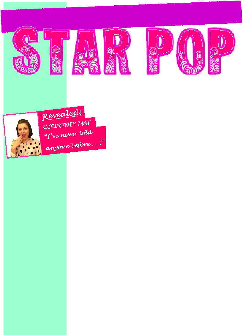
Exclusive Interview With
Today I changed the colour of the 'exclusive interview with' text on the front cover of my music magazine to a baby blue colour. I have done this because it was previously pink but now I have changed the background pink I couldn't have pink text on a pink background as it would be very difficult to read.
Fresh Music
Now I have moved the 'fresh music text' as the green bar down the side of the front cover no longer exists. i have moved the text to the bottom of the page and placed it in an arrow which is pointing right. the arrow is baby pink with a light blue out line, this maintains the colour scheme.


Behind the arrow I have added a light purple bar (it is the same colour as the skyline). In this bar I have added images of people that will feature in the magazine. This will interest the reader and make them want to find out more about why the people are in the news so they will buy the magazine. Another reason for me adding the bar is because most pop music magazines have something running across the bottom of the page. Also in this bar, in the bottom right hand corner of the magazine, I have included the box that contains the barcode, the issue number, the date and the price. In addition I have added an image of Rachel popping out from behind this box so that it adds a bit more fun and originality to the front cover of the magazine.
I have added the bar at the bottom of the page rather than anywhere else because I originally had the main image touching the bottom of the page which left a large gap above the girls' heads and I was unsure of what to fill this gap with. My solution was to add the bar and then move the image up and fill the empty space above. I have also moved the 'exclusive interview with' text from over the image and above the CRUSH logo to above the girls' heads instead. I did this because I didn't want too much text to take over the main image and now it also fills space above the image.

Background
Today I have taken out the green bar from the left hand side of the front cover of my music magazine. I removed it because there was not enough space for it and it was an impractical feature on the front cover. in addition I didn't like the colour of the column. I have replaced the bar with a pastel/baby pink background for the whole of the front cover. I have added in a background colour because without it I felt that the front cover looked too plain and simple. however I have made the background very, very light so that it is not too overwhelming for the reader.
Skyline
Today I have changed the skyline at the top of the front cover of my music magazine. I have changed the background colour from a very bold purple to a very light pastel shade of purple. I have also changed the text going across the skyline, I have done this because my media teacher has advised the class to keep the number of different fonts on the front page to a minimum. Therefore I decided to use the same font that I used for "exclusive interview with." again I used an internet site to generate the font. However I did decide to keep the love hearts in-between each word but this time I have added a slight glow to the hearts for more of an effect.
The reason that I changed the colour of the skyline was because I wanted it to in-keeping with the pastel sort of theme however I stuck with purple as I still want it to stand out slightly.

The reason that I changed the colour of the skyline was because I wanted it to in-keeping with the pastel sort of theme however I stuck with purple as I still want it to stand out slightly.

Saturday, 7 December 2013
Blue Box - Text
Now I have added the story/ text to the blue box. I have
started it off with a quote which is made clear to the audience because of the
speech marks, the fact it is in italics and it is larger than the rest of the
text. The quote it written in white with a blue outline which makes it stand
out from the rest of the double page spread which is just in black.
The text links to
the title and the quote but goes on to give further information about the story.
I have also used an anecdote in the text, instead of just saying ‘baby’ I have
made it more interesting by saying ‘the pitter patter of tiny feet’. This makes
the article less serious and more interesting.

Blue Box
Today I have started
work on the blue box on the double page spread of my music magazine. The first
thing that I did was to put a picture in. I used one of the pictures that I took
of Rachel when I took all of my experimental pictures. In the image Rachel expresses a surprised/happy look. I chose this image
because I wanted the story in the blue box to be something that will shock the
reader. For the image I removed the background because it was not suitable for
the magazine, I did this using the online background remover again. I replaced the
old background with a new plain white one.
The next thing that I
did was produce the title for the blue box. I did this using an ordinary font
from Microsoft Publisher. I then put a cloud, with a black outline, around the
text for effect. The first line of the text is in bright pink and italics so that
it stands out to the reader. It also has an exclamation mark for emphasis to
show the reader that the news is important. The next line of the text is in
plain black which acts as contrast. This line of text reads ‘Baby Madness’,
this gives the reader an ideas about what the article is about and makes them
want to read on. My next step will be to add in the text.
Completing The Contents Page
Today I have
finished the contents page for my music magazine. I checked over the magazine
to make sure that all of the text was correct and that there are no spelling
mistakes. I also moved things around so that they were in the correct position
and I checked that the page looked good as a whole as oppose to each section
individually. I feel that it does and I am very pleased with the contents page,
where I have positioned everything and the design of the page. I feel that the
page fits in with the pop magazine theme and will appeal to my target audience.
Description of Pages
Next to the page numbers, I have now added individual
descriptions of each page. The descriptions are also black and pink but are the
opposite colour of the page number so that they are alternating. I did this to
add a bit of variety and a bit more colour and so that the text does not just
merge into one big chunk of text.
Page Numbers
Today I have added
individual page numbers to the contents page and I have also added a sub-title
for this section. For the sub-title I have used the same font as the main title
for the contents page. I have done this so that the reader knows that it is an
important part of the contents page and includes significant page numbers that
they will want to be aware of. However this sub-title is not as big as the main
title of the contents page, this is because, while it is still important, it is
not as important as the main title. In addition there would not be enough room
and it would not be practical for the sub-title to be as large as the main
title. The sub-title is “Inside This Month...”
I have also added all
of the relevant page numbers to the contents page today. The numbers are very
big and in bright pink and black. I have specifically chosen these two colours
because they are both very bold and noticeable, rather than just blending into
the background, and they both contrast one another.
In addition I have
added a grey border around this section to separate it from the rest of the
contents page and so it does not blend with other features.
Contents Page - Competition
I have decided to have a section on my contents page
advertising the competition page at the back of the magazine. I have done this
because for many young girls the competition part is their best part of the
magazine as they love entering competitions.
I began this section of the contents page by typing out ‘Contents...’ in
bold pink. This is acting as the title for this section.
I then added the
competition bubble that I have also used on the front page and double page
spread. I did this as it is an important competition that many girls will want
to win. I then added a large picture of Hatty (as Courtney May) that I have taken
previously, there is no background to this image as I removed it using an
online background remover. Next I added the competition relevant to ‘Courtney
May’ down the right hand side of the image so that readers can relate the image
with the competition. The text for this is a size 16 and in bold so that it
stands out to the reader.
The final step for
the competition section was to add the page number. For this I used Microsoft
PowerPoint to generate a bold, blue star and then (in white text) I wrote in
p49. Here is how the competition section looks:

Cool Posters
At the bottom of the
contents page of m y music magazine I have inserted an advertisement for
posters throughout the magazine. I have chosen to do this because many pop
magazines for young girls tend to have at least one poster within the magazine.
To create it I inserted into the publisher document, where I am creating the
magazine, a bold blue rectangle. I edited the rectangle so that it fits along
the bottom of the contents page. The next step was producing the text that
reads ‘cool posters’. I produced the font this time using Microsoft PowerPoint
rather than a font generator. I selected two different light shades of blue for
the text because blue is normally associated with the literal meaning of the
word ‘cool’- cold and icy. I have also added a slight glow to ‘cool’ because it
also fits in with the cold and frosty image.
The next thing that I
did was to but some examples of posters the reader would find throughout the
magazine. The images that I have selected for this are images that I have
already taken throughout the production of my music magazine. For example I have
used the album cover that is show on the cover page of the magazine. I have
overlapped all of the images to give them a fun and interesting look as I feel
if they were all in a straight line it would make the magazine look too boring
and simplistic. Below is an image of the ‘cool posters’ bar :


Friday, 6 December 2013
Title
The title of my contents page is "It's Poptastic..." I have used the ellipsis so that the reader knows to read on to discover what is in the magazine. I have also used it for effectiveness and I think that it looks aesthetically pleasing too. I created the title for the contents page using an online font generator. I have created the title so that it is black, bold and very creative. I have produced it in this way so that it is very clear to the reader, so that it stands out and is very unmissable when you turn to the contents page.

Contents Page - Third Image

For the third image on my contents page I used on of the pictures of my friend (Hatty) that I took for the front page of my music magazine where she was in front of the green screen. Because she was in front of a green screen I had to add in an alternative background as I didn't want the green screen as my background. Instead I place in a light pink background, I did this using a pink square from PowerPoint. I used pink because it fits in with the quite qirly image of Hatty. Again I placed the yellow square with page number on top in the bottom right hand corner of the image. I copied the square from the first image and produced the page number using a font generator. I have also added another quote below this image to advertise this specific article in the magazine.
I have placed this image to the right of the main image on the contents page and just below the second image. So far the contents page looks like this:

I am pleased with the way my contents page is coming along because it looks very fund and poppy but at the same time looks professional. I am also pleaded with where I have positioned the images because I feel that this will appeal to m y target audience rather than a page that consists of mainly text and drab, boring colours.
Contents Page - Second Image

For this image I used the same picture that I used for the "The Key to Music" article on my double page spread. However this time I didn't remove the background as I didn't think that a plain white background would be suitable for the contents page. Like the previous image, I have placed a yellow square in the bottom right hand corner of the image with the page number on top of it.
As you will also have noticed I have put a quote and text explaining what the image and quote are advertising in the magazine underneath the image. The text under the image is to entice the reader into reading this particular article. The quote is clear because it is in bold blue, italic and the speech marks at the start and end are very apparent.
Thursday, 5 December 2013
Contents Page - Quote
Underneath the main image of the contents page I have included a quote that is relevant to the image. The quote is is bold blue an italics so that it is very clear that it is a quote. I have taken the quote from the interview on my double page spread. The quote will interest the readers and make them want to turn to the article and read it. I intend to put quotes under other images that I will do in this format.
Contents Page
For the contents page I don't just want it to consist of a list of page numbers and text. Therefore I will only be doing roughly 10-15 pages in this format. For the rest of the pages I will use pictures of the people in the articles with the page number in the corner of the image, I have already started work on the first one:


The image above will be the biggest on the contents page as it is the main feature of this issue of the magazine. To produce this image I added in a grey background using Microsoft PowerPoint. I then inserted a yellow square and edited the transparency of it so that it is a little bit see through. I feel that this adds a more poppy look to the page it also adds to the special effects of the page. I think that it will also be impressive to the readers. I then tilted the square so that it looks like a diamond over the right hand corner of the image. I did this because I felt that the square looked far too plain and simple. Next I added the page number (08) over the square so that you can see the number as the text is in white therefor without the square you would not be able to read the page number. I produced the page number using a font generator. I have produced the image for the contents page in this way because it is original and different and will please my target audience. I intend to do at least 2 more images like this one but slightly smaller and to the right of this one.
Contents Page
Today I have begun work on my contents page. I started by selecting a shape from Microsoft PowerPoint, the shape that I selected is called "Flowchart: Delay". The shape is like a rectangle with one of the sides rounded off. Once I had selected the shape I changed it from blue to a bold pink. Then I pasted the image onto the blank page in my Music Magazine Publisher file, then I just enlarged the shape. Next I inserted a white, portrait rectangle over the pink shape. I put in the white rectangle so that I can layer on top the rest of my contents page.
I wanted the background to look like this because I think that it is something new and different but at the same time fits in with the pop genre of my magazine.

I wanted the background to look like this because I think that it is something new and different but at the same time fits in with the pop genre of my magazine.

MGTM Music Awards - Text
For the text I gave information about the awards the people in the first two images won. I also gave them Hollywood names to make them them sound famous and like they are genuine celebrities. For the second image of Kelan and Grace I said that they were boyfriend and girlfriend and gave a bit more information about that. For this piece of text I was much more formal as I wanted it to come across as important information and in the way that newsreaders present the news.
For the first image, as it is longer portrait rather than landscape, I have wrapped the text around the image so that there is not big, blank spaces either side of the image. Whereas I have written the text underneath the second image as this image is bigger landscape rather than portrait.
The text is white because I wanted it to contrast the black text of the interview on the same page. In addition it adds a bit of variety to the page to keep the reader interested rather than the page just looking like one huge chunk of text.
Advertising For The Next Page
Along with the third image of the column, I have also added three baby blue arrows in sequence to indicate to the reader to turn the page for the next article.


I have also added text above the image that reads, " who wore what? " This suggests to the reader that the next article will be informing them of what people wore to the music awards. The question mark also adds an element of mystery for the reader making them want to find out what people wore.
MGTM Music Awards - Third Image
The third image in the column is linked to the MGTM awards bot is advertising an article overleaf (on the next page). The article is about who wore what to the awards.
The picture is also one that I took in July at prom but this time is of Tara. For this image I removed the background of prom, using the same online website as before, and inserted the advertising board with the MGTM logo on that I used for image one, as the new background.

MGTM Music Awards - Second Image
The second image that I used for the music awards column I also took at prom in July. This image is of another two of my friends (Grace Parcell and Kelan Fox). For this image I decided not to remove the background as I wanted it to be inside the awards ceremony rather than outside on the red carpet and therefor more casual i.e. them posing less.
MGTM Music Awards - First Image
Today I have produced the first image for the music awards column. The image that I used was an image that I took of two of my friends (Sarah and Collette) at prom in July. I wanted to use this image because the girls are in formal attire and therefore look like they could be going to an awards ceremony as both have the same dress code.


Above is the image of the girls at prom before I edited it. I decided to edit it because they are meant to be going to the MGTM music awards so I felt that it would be fitting to have the girls on a red carpet.
So firstly I used 'clipping magic' (an Internet website) to remove the background of the image . The image then was just the girls and a plain white background and my next step was to add in an alternative background. Next I created a logo for the MGTM music awards because I wanted the logo to be behind the girls on the red carpet as an advertisement board like that which celebrities are normally photographed in front of at similar events. To create the logo I typed MGTM in block capitals and then on the next line music awards. Then I simply wrapped a red oval around the text for a more 'Hollywood' look. The logo is shown below:
The next thing that I did was to copy and past the logo into a Microsoft PowerPoint document numerous time and align them on the white background of the powerpoint so that it looked like a professional advertisement board at a music awards ceremony. Then I needed to put in the red carpet. For this I just inserted a red rectangle at the bottom of the advertising board and gave the red rectangle texture using the different effects on powerpoint.
Then all I had to do was place the image of the girls over the background image to make a new image of the girls at the music awards. I also had to position the girls so that it looked good with the advertisement board in the background- so that the logos were not in strange places. The finished result is shown below:
MGTM Music Awards
I have decided to full the column along the right hand side of my double page spread with information about the MGTM music awards which I have created for the magazine. I will need to create a logo for the awards and take images of people who look like they have been to an awards ceremony.
Sub-Article Image
The image in the sub-article on my double page spread I took of my next-door neighbour at home. I specifically wanted him as he had the hair that I needed for the image. In the image I have removed the background behind the boy and replaced it with a plain grey one so as not to draw the reader's attention away from the article. I then placed the image in a circle to give it a fun poppy look. However not all of the image is restricted by the circle, the boy's hair slightly overlaps and comes out of the circle. This adds effect and excitement to the image. When taking the picture of the boy i specifically used a prop (headphones) to represent the sub-article as it is relevant to song writing, music and the the fact that the audience will be listening to this specific artist's music. The boy is representing the artist Shaun Dean.
I have enlarged a quote from 'Shaun Dean', put the text in italics and emphasised the speech marks around it to draw attention to the article. The quote is also interesting and will make readers want to read the article.
I have enlarged a quote from 'Shaun Dean', put the text in italics and emphasised the speech marks around it to draw attention to the article. The quote is also interesting and will make readers want to read the article.
The Key To Music
As the title of the sub-article is 'the key to music' I though that it might be quite clever and meaningful to add a lock and key hanging from the U of the word 'music'.


Firstly I tilted the word 'music' to add more of an effect to the image. Then I found the image of the lock and key, as seen above, in the clip art section of Microsoft publisher. Once I had found the lock and key image I then used the recolour option on Microsoft PowerPoint to make the lock and key blue as it was originally black. Next I copied the image so that it appeared twice on the screen, then I cropped both images so that they were both half of the lock and key image but when joined together they would make the full lock and key image once more. I did this so that the lock and key would appear to be hanging off of the U. I sent the left half of the image to the back and brought the right half to the front to give the desired effect.
Green Box
The green box to the bottom left of my double page spread I have started to fill with a smaller story/information that would be interesting to the reader - a sub-article. From research of pop magazines I have noticed that very rarely would a professional magazine have only one article on a double page spread as they want to make the most of the space that is available and not swamp the reader with too much information on one article.
To begin with I changed the original bolder lime green to a softer, pastel, pea green. I did this as I didn't want to make the spread look too bold and cheap. I created the box using the 'shape' option on Microsoft Publisher. The next step was producing the title for this sub-article. I produced the font using a font generator from the internet. The title is, "The Key to Music." The words 'the key to' are in a softer font that looks handwritten and 'music' is written in a bolder more hard hitting font for emphasis. I have produced the font in black so that the box is, again, not too bold and therefore does not make the article look to cheap and tacky.
To begin with I changed the original bolder lime green to a softer, pastel, pea green. I did this as I didn't want to make the spread look too bold and cheap. I created the box using the 'shape' option on Microsoft Publisher. The next step was producing the title for this sub-article. I produced the font using a font generator from the internet. The title is, "The Key to Music." The words 'the key to' are in a softer font that looks handwritten and 'music' is written in a bolder more hard hitting font for emphasis. I have produced the font in black so that the box is, again, not too bold and therefore does not make the article look to cheap and tacky.
Article
Today I have finished off and edited my article for my double page spread. In the article the interviewer is very informal when asking the girl group questions, this is because formal questions would come across too serious and perhaps too complicated for my young target audience. While I and aware that formal questions give the impression that the interviewer is professional and has experience, I don't believe that my target audience would be able to relate to this format. In addition I don't think that, for my target audience, they focus on weather or not the interviewer uses correct English, they would rather the interviewer be on their level and asking questions that they would like to know the answers to.
For this reason I have used very chatty and informal language when asking the questions, I have also made the questions personal and revealing in favour of the fans.
Initially I intended to format my article in columns as many other magazines and newspapers do. However, after evaluating different magazines that have published interviews in the past in the question and answer format, I have noticed that many do not use columns for a double page spread interview as there is not enough room. As my double page spread has boxes and different stories dotted around it, I think that a no-column format is best fitting for the interview.
In terms of the responses of the girl group I have tried to make their responses very loud and interesting. I also used things such as the word 'giggles' in brackets so that the audience feel more involved in the interview and they know what is going on while the interview is being conducted not simply the answers the girl group give. This also brings humour to the interview/article it suggests to the reader that if the girl group are laughing then it must be funny, so they will laugh and find the article more interesting too.
Also in the article I have used dramatic short sentences, such as when Megan replies "well." to the interviewer. This builds suspense for the reader and makes them aware that something interesting is coming. It also makes the reader want to read on and learn more about the situation.
In addition I have used long, descriptive sentences in the final answer given by the girl group. This is to summaries and tie up any loose ends in the interview. It also slows down the interview slightly (whilst still giving detailed information) and brings it to a close.
Competition
I have placed the competition bubble that I produced for my double page spread on the front cover of my music magazine. I have done this because the competition is related to the main feature of my magazine ( the girl group) therefore the competition is relevant to the main coverage. I have placed the bubble near the main image of the girl group so that, after the image, people's attentions will be drawn to the bubble especially as the first word is 'win' which people are always attracted to.
The bubble will also entice the reader into buying the magazine as it tells them there are prizes up for grabs and competitions in the magazine. Another reason that specific competition will entice readers is that many young girls would love to get up close and personal with their stars.
The bubble will also entice the reader into buying the magazine as it tells them there are prizes up for grabs and competitions in the magazine. Another reason that specific competition will entice readers is that many young girls would love to get up close and personal with their stars.
Bar Code
Today, using my research, I added my bar code, date and price to the front cover of my music magazine. To begin with I needed to find a bar code, for this I just copied as pasted a bar code from google images. I did this because it is the only image throughout the magazine that you are allowed to copy and paste from the Internet, the rest I have to produce myself.
Once I had the barcode I thought that it would be a good idea to put it, along with the date, the issue number and the price in a white box so that the information is clear to the audience but not too bright and bold as this would put them off.
I have placed all of this information in the bottom right had corner of the front cover, so that it is not taking up and wasting any much needed space on the cover. It is placed overlapping the main image therefor nothing else could be put there so I am saving as much space as possible.
Saturday, 30 November 2013
Date, Price and Barcode
Today I have been researching where different put their barcode, the date and the prices on their magazine front covers. I have done this so I can get some kind of idea where to put mine.
In the images below the date, price and barcode are circled.


In the images below the date, price and barcode are circled.


Skyline
The image above is the text that I have added to the purple banner at the top of the front cover of my music magazine. I added this because it informs the reader of what to expect from and inside the magazine. I produced the text by using a font generator on the internet, however when I did this the text was black so I have coloured it blue. the reason I chose blue is because, along with the purple banner behind it, it will really stand out to the readers. I generated each word individually so that I could insert hearts in-between words. I added the hearts to break up the words and to add a bit of individuality and appeal to the magazine.
Front Cover

Today I have added information to the little bubble in the bottom left hand corner of the front cover of my music magazine. I created the text for it, again, using a font generator from the internet. I chose to use blue text because it contrasts to the pink behind it, so it adds colour to the cover. I also fell that, along with the colours, the font of the text will appeal to and entice readers to buy the magazine. You will also notice that beside the text I have produced an album cover to demonstrate the article. To produce the album cover I used powerpoint. I coloured the background in purple and added heart shapes all around. I also added a picture of Megan to the album cover which suggest that it is her CD. I took the image on the same day as the rest of my images of the 'girl group'. In this picture Megan looks a bit cheeky which links in to the title that I have given the album, "Cheeky Little Secrets".
Bold Boxes
The bold boxes scattered around the page I intent to fill with 'smaller' news stories. For example in the large pink box down the right hand side of the double page spread I intend to fill with images of girls dressed up for the R.O.Y.A.L music awards and judgements on what they are wearing.
Competition

I decided to add a competition to the magazine to add even more appeal to it for the audience. it will give people the opportunity to get up close to their favourite girl group, which some young girls would die for and therefore but the magazine simply to try and win. For this reason I will be adding an advertisement of the competition to the front cover of the music magazine.
I also added a competition to the double page spread as it fits in with the article in addition it brings colour to the page.
I created the image above by producing two circles, one pastel blue with and shading effect, and the other pink and placing the pink on top of the blue. I chose the colours because they fit in with the theme/colour scheme of the magazine.
The text on top I produced by using a font generator from the internet again. I used that specific font because I think that it fits in with the idea of a competition and represents it well. You will notice that the name of the band 'crush' is in capital letters and larger than the rest of the text to draw immediate attention to it for 'crush' fans. The competition will also draw attention as the first word in the bubble is 'win' which many people will be drawn to as people love getting things for free.
Star
I added the star as another attempt to entice the reader into reading the article. This would be the case as I have added "#youhearditherefirst" this suggests that the information enclosed in the article has never been heard before as the girls have never told anyone else. This reaches out to the reader and makes them feel special and like they are connecting with the girls and the magazine. The hash tag feature will also appeal to my young target audience as they all use and love twitter, it also gives them the opportunity to physically connect with the magazine. The star is also a space filler but at the same time adds colour and appeal to the article.
Image
The image that I have used for the double page spread is of the four girls in the girls group presented on the front cover. The image links in to the title and the content of the text because in the image Megan is standing alone on the far left and the other girls are leaning to the right whispering to one another and at the same time looking shocked at the news that they have just heard from one another. the reader will automatically assume that the three girls are talking about Megan's mystery man first presented in the title. Megan is also standing very boldly and proud with her hip, it is also clear that she can see the girls whispering but she doesn't care because she is pleased with herself.
The image is very large and in the centre of the double page spread so when the reader turns to this page it is the first thing that their attention is drawn to. I also feel that the image will entice the audience into reading the article.
The image is very large and in the centre of the double page spread so when the reader turns to this page it is the first thing that their attention is drawn to. I also feel that the image will entice the audience into reading the article.
Content
Today I have decided that for the content on my double page spread I will produce an interview with the featured girl group 'CRUSH' from the front cover. I have decided to produce an interview because many magazine double page spreads are in interview form. In addition the only other option that I was considering was to do a story on the girl group rather than an interview. I decided against it as I felt an interview was more appropriate for my target audience. In addition I don't think that a story would best fit the magazine.
In producing the interview I will create it in a question - answer format, the interviewer and interviewees taking it in turns to speak i.e. asking and answering questions. I will present the questions from the interviewer with a large Q and answers from the girl group with a large A.
In terms of the content of the interview I will need to ensure that I include information that links to my juicy title. I will also give information about other things and brush upon the feature in the title, as this is what, from experience, many popular magazines do.
Title
The title for my double page spread is "A new man on the horizon for Megan?" The colours that I have used for this are a pastel pink for the text and a pastel blue for the semi-circle behind it. I have specifically chosen these colours because they link back to my front cover and carry the theme through to the double page spread. I also think that these colours will appeal to my target and attract them to the article.
The text that I have used for the title I produced by using a font generator on the internet. I used this particular font because I feel that it fits in with the content of the article. I also selected it because my target audience will see it as fun and cool.
For the wording of the title I played around with different headlines that I thought would best suit the article and at the same time appeal to the audience. The title that I have selected presents to the audience the idea of a juicy new story about Megan and her love life, it also adds an element of mystery for them because it doesn't give a lot away. Therefore this entices the reader into reading the article.

Thursday, 28 November 2013


Tuesday, 26 November 2013
Progress
Now I have added the text for the girl band and my main image to my magazine front cover. It took me a while playing around with them to try and get them in the right positions so that it looks professional. I have also added two pink (different shades) parts of circles to the bottom left hand corner of the magazine to cover up the missing half of Megan's leg.

Images
Today, using the website previously mentioned, I removed the background from the image that I wish to use as the main image for my front cover.

As you can see, because of where the table was, half of Megan's left leg is missing. I intend to remedy this by putting a pink bubble, with information in, in front of it.
Design
Today I have continued to put my music magazine together. So far I have edited the original colour for the colour of the column going down the left hand side of the cover. I have changed it from a bolder, deeper blue to a lighter baby blue. I did this as I thought that it would be more age appropriate for my target audience. In addition I feel that it fits in more with my colour scheme and theme.
here is a preview of the magazine so far:
I have also inserted the image of Harriet that I have previously selected. I have placed it in a box with a plain, white background and a pink rim around the edge of the box. I have also put the story concerning Harriet linked to the right of the box. The white text on a block pink background adds a fun, young and poppy element to the magazine. I also feel that both the style and colours used for this will appeal to my target audience.
You will also notice that I have added the banner at the top of the magazine front cover. I have done it so that the banner is purple so that it stands out from the rest of the main cover as the rest of the cover is all pinks and blues. I have also done this as in my research I have noticed that other magazines too used bold or outlandish colours for this banner so that they stand out more.
As you will also have noticed I have slightly tilted the banner so that it is not exactly straight. I think this adds more of a fun element to the magazine, in addition it makes the magazine appear less serious and age appropriate for my target audience.
Font
For the name of my girl group I want it to be very big and noticeable on the front cover. I also wanted it to be representative of both my music magazine and the girl group. I also want the text to be very big because this would suggest that the girl group is very popular and well known therefore the magazine want to advertise that they have an exclusive with these pop megastars.
I produced the font by using a font generator on the internet. I copied and pasted the text into a paint document and then filled all of the white patches with a baby blue to give it a more rustic and individual look.

(the title for the
girl group)
I also used a font generator to produce the text introducing the girl group, this is shown below. I selected this font and colour for the text because I feel that it fits in with my theme and colour scheme.

Photography
After I had chosen my main image for the front cover I encountered a few issues. The first being that the girls exceeded the green screen, I knew this would be an issue when I was going to attempt to remove the background. I first tried to remove the background using applications on the desktop, such as PowerPoint, paint and publisher. However when this failed I decided to search the internet to see if I could find anything that would help. to my surprise I found a wonderful website that was easy to use and removed the background wonderfully without leaving any traces of background behind. Below is a screen shot of the website.

The second issue that I encountered was that the table blocked out Megan's leg. This was a fault in my own photography skills that I could have noticed when taking the picture. However it was easy to remove the table using the website mentioned above.
Photography

The image above is the one that I have selected to be on the front cover of my music magazine. I feel that in this image the girls look much more sassy and comfortable in posing for the camera, they look as if they know what they are doing because they have done it many times before. The girls also look like they are comfortable with each other and have know each other which is what I required as I needed them to look like a famous and professional girl group.
Another thing that I am pleased with in this image is the effect of the girls' legs crossing over each other, I feel that it will add a more dramatic and professional tone to the magazine.
Photography

I also felt that this image was inappropriate for my magazine, however I am still glad that I took it so that I had a range to choose from. My issue with this one is that Megan (in pink) her head is in the way of our view of the girl behind her (Libby's) head. Also The girls' facial expressions and body language does not suggest that they are pop stars or even comfortable with the situation.
Photography

The image above is the first picture that I took of the girls. I didn't think that this image was appropriate for my front cover as I don't think that I have taken it very well. To begin with the camera is not directly in front of the girls, it is slightly to the left, and secondly I don't think that the pose the girls are doing in this image is the best out of all the other poses that we did. However the image is strong as all of the girls have fitted onto the green screen and they are all looking directly down the camera lens.
Subscribe to:
Comments (Atom)